Restaurant
A website concept for a Mediterranean restaurant: it lets the photography speak, makes the menu easy to read and leads straight to booking a table.

What this concept explores
What people choosing where to eat need, and how a website can answer.
People choose a restaurant mostly by what they see on the table and in the room. Anyone looking for somewhere to eat wants a sense of the atmosphere, a look at the menu and an easy way to book a table.
The concept gives the main space to photography, presents the menu like a printed one, with clear prices, and keeps the button to book a table within reach at all times, with no effects or decoration to distract.
- Get a feel for the place from the first image.
- Read the menu and prices without downloading anything.
- Ask for a table in one tap, from a phone too.
A design exploration created by ELEVA. It is not a client commission: the menu, prices, hours and photographs are examples.
Design decisions
Three decisions so the website feels like going there.
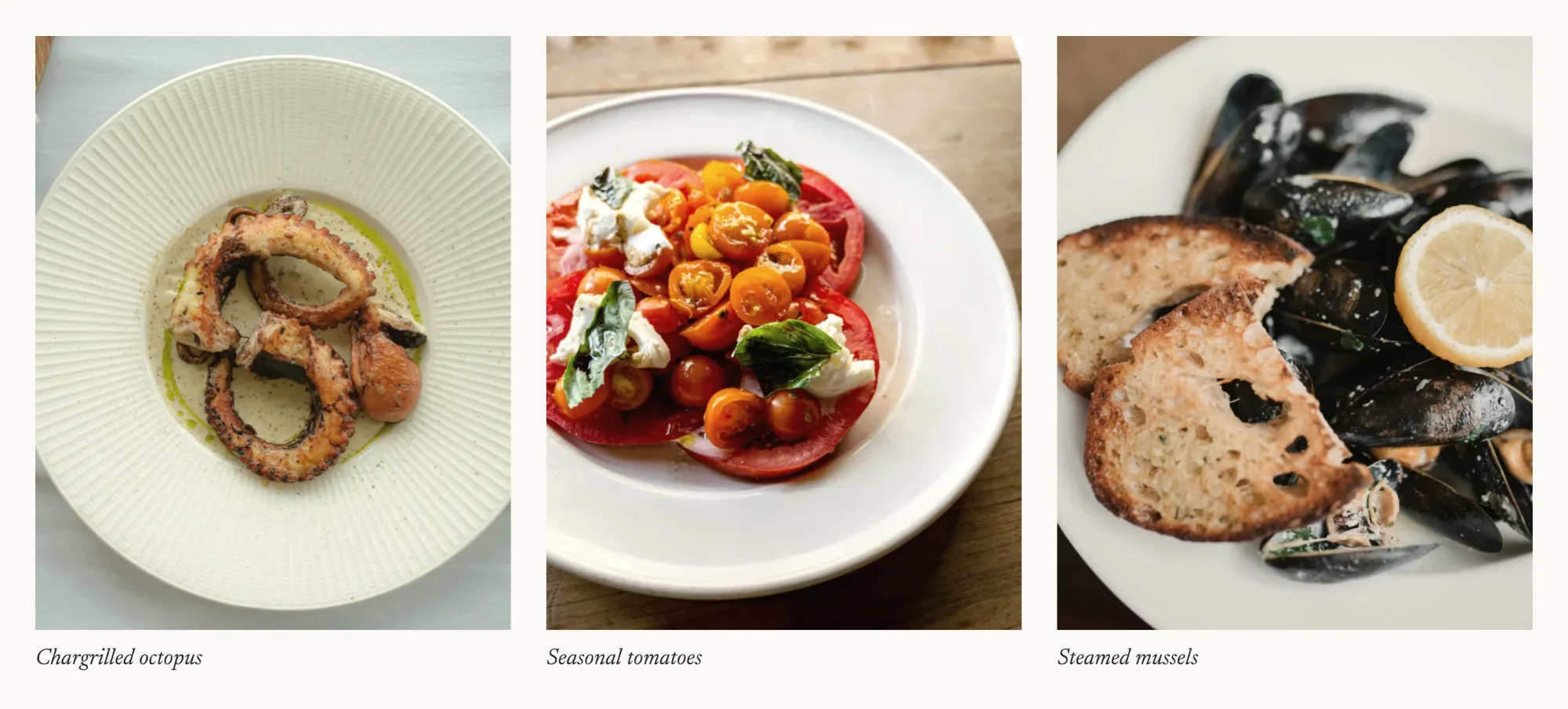
Photography in the foreground
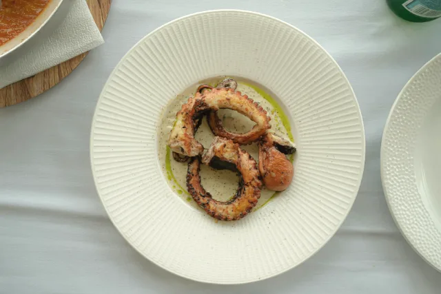
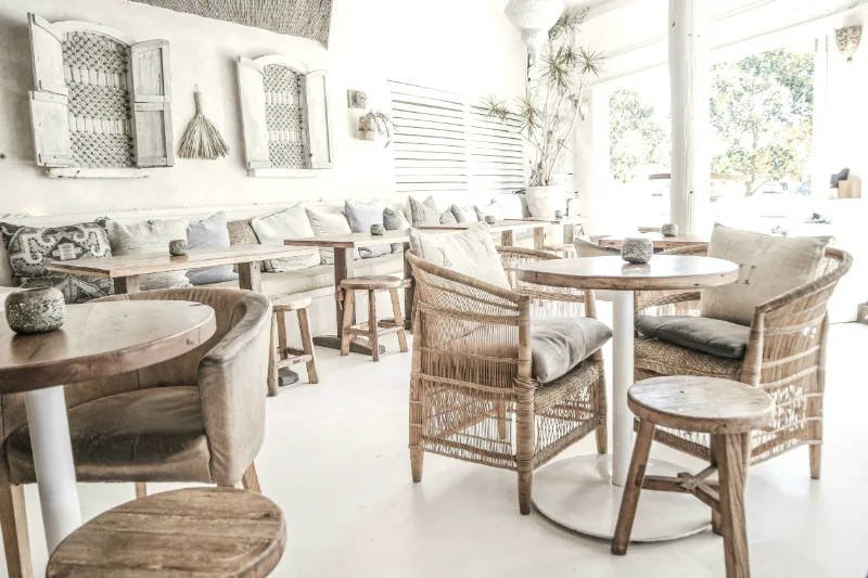
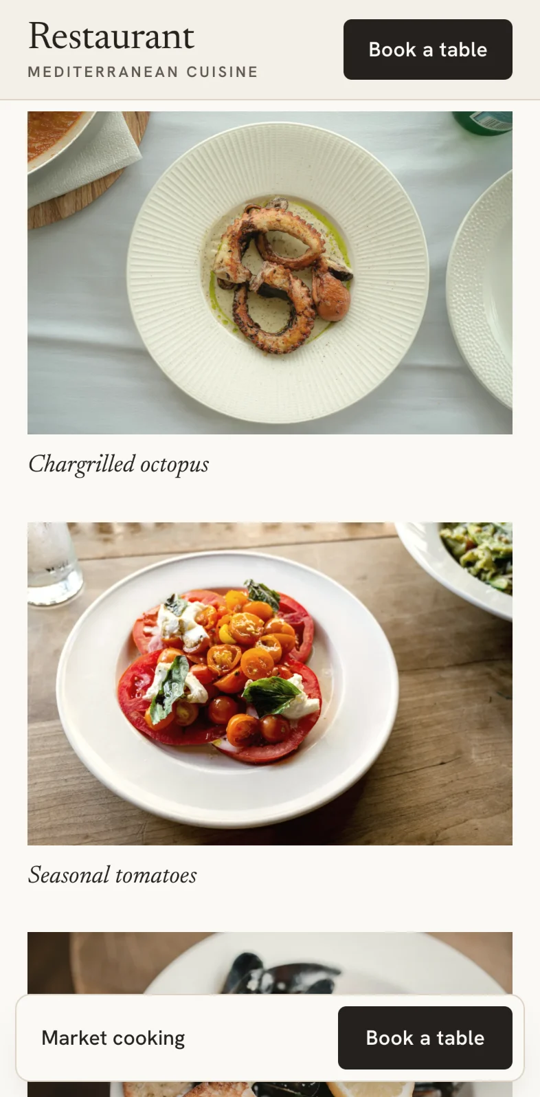
Large landscape images of the room and the dishes, with one colour treatment so they read as a single series. The text supports them; it doesn't compete.
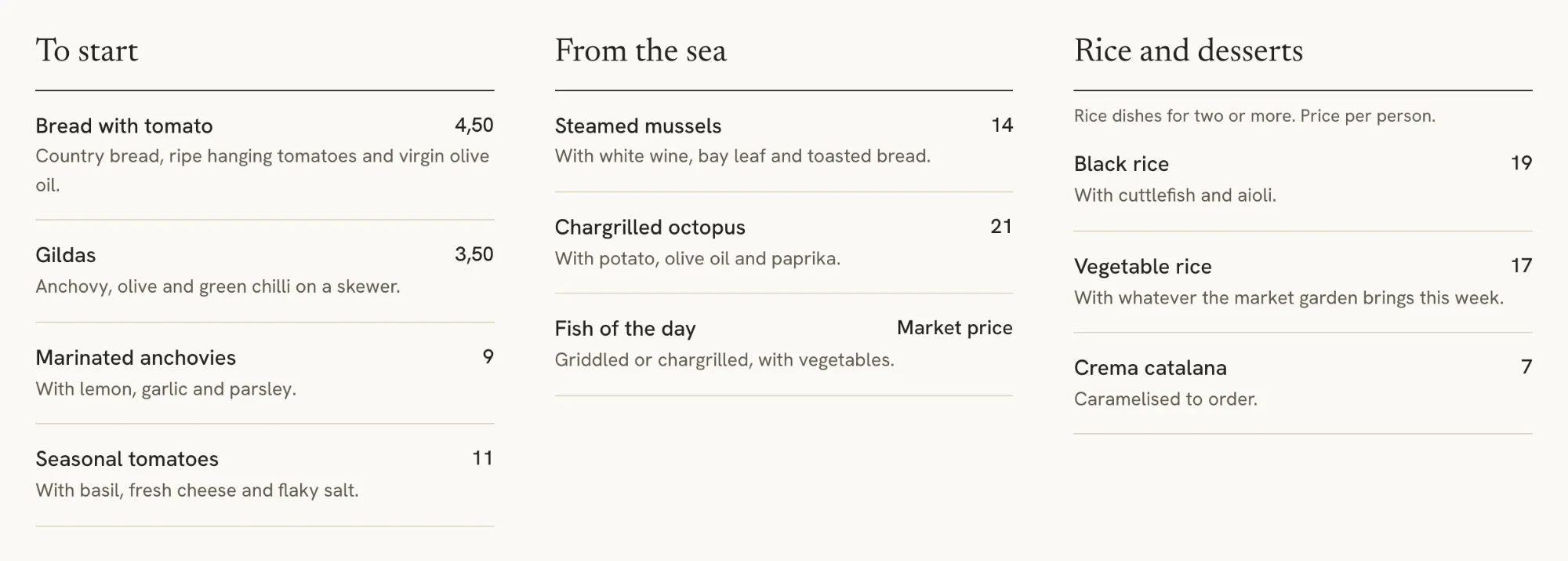
A menu that reads like a printed one
Three columns, clear names, one line of description and the price aligned to the right. It's text on the page, not an image or a PDF: it reads well on a phone and can be updated in moments.
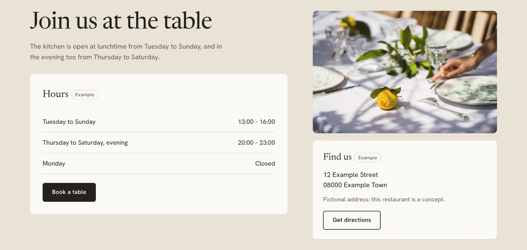
The hours and “Book a table”, together
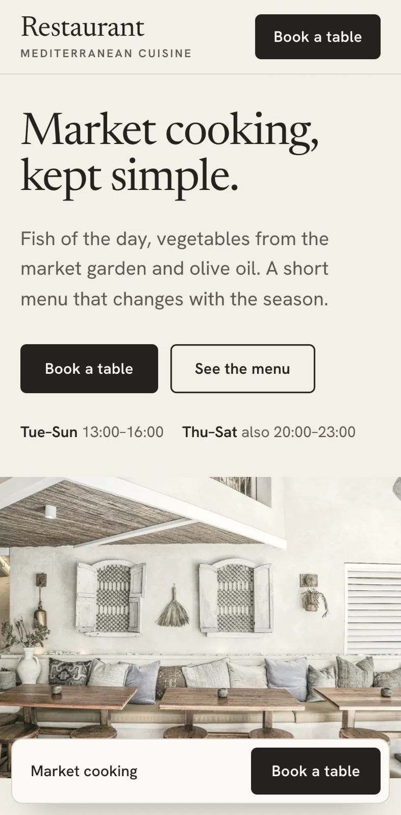
The hours sit beside the button, so nobody has to look for them before deciding. On a restaurant's website, the button leads to the channel it already uses: its phone, its email or its booking platform.
Identity
A light stone background, charcoal text and a single olive accent. An editorial typeface for headings and a very legible sans-serif for the menu.
Market cooking, kept simple.
Fish of the day, vegetables from the market garden and olive oil. A short menu that changes with the season.
Newsreader, an editorial typeface made for reading, for the headings; Hanken Grotesk for the menu, the prices and the hours.
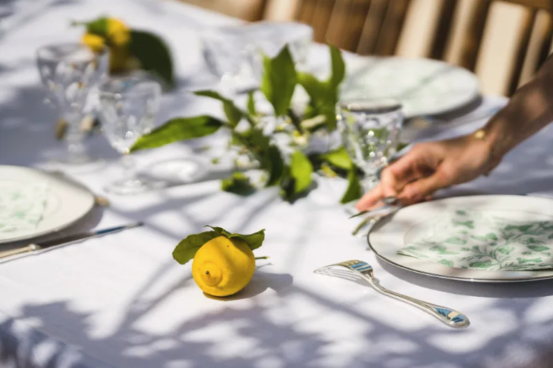
The whole page
Scroll inside the window to go through the concept from top to bottom, as it looks on a computer.

Or open the concept and browse it.
On a phone
On a phone, the photography stays up front, the menu falls into a single column and the button to book a table is always within reach.
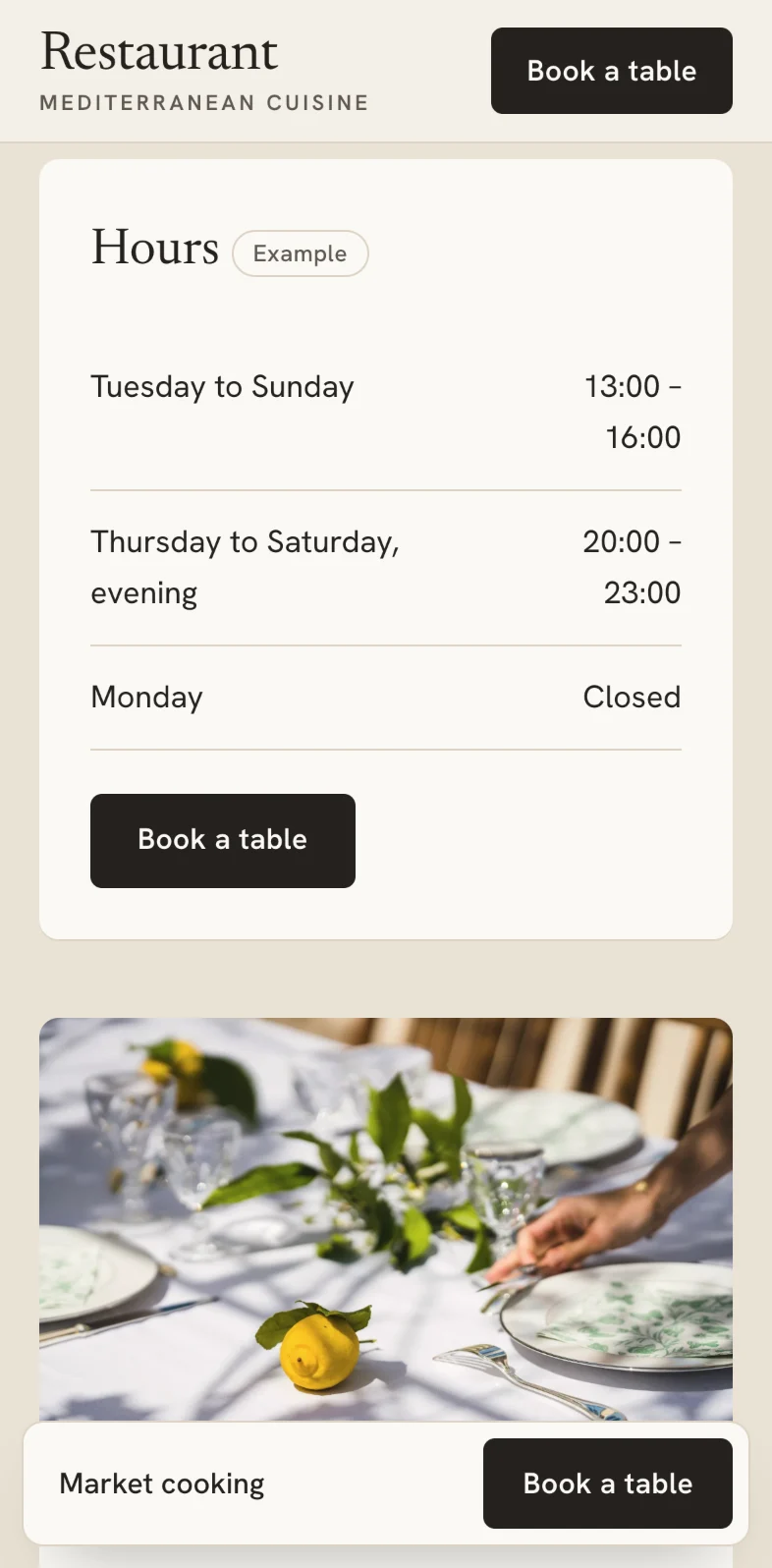
Real screenshots of the concept on a 393-point-wide screen.Open it on your phone