Physiotherapy
A website concept for a physiotherapy practice: calm, easy to read and designed so that booking an appointment is the natural next step.

What this concept explores
What a new patient needs before calling.
People looking for a physiotherapist are often in pain and short on patience. They want to understand whether they can be helped, what the first visit is like and when they can go.
The concept explains it calmly: treatments with pictures and no jargon, the first visit in three steps and the hours always in view.
- Book an appointment in one tap, from a phone too.
- Understand the treatments without jargon.
- Know the hours and what to bring to the first visit.
A design exploration created by ELEVA. It is not a client commission: the copy, the hours and the photographs are examples.
Design decisions
Three decisions so the website answers what a patient is looking for.
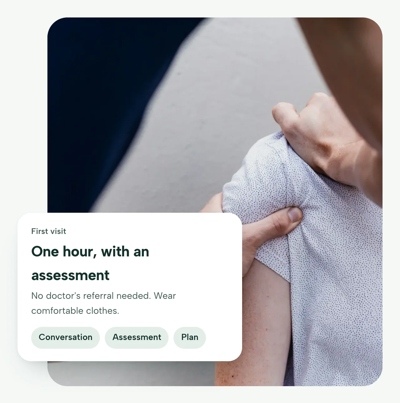
The first visit, explained up front
Over the photograph, a card says what the first visit is like: one hour, with an assessment and no referral needed. “Book an appointment” leads to the channel the practice already uses: its phone, its email or its booking platform. On a phone, a fixed bar keeps the button at hand while reading.
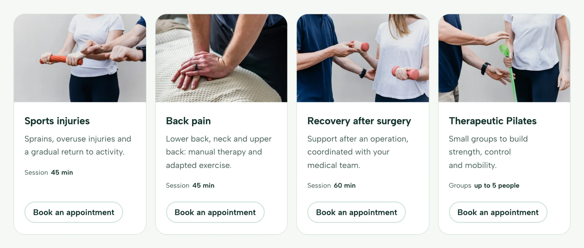
Treatments explained with pictures
Each treatment has a photograph, one clear sentence and the session length. No jargon: patients should recognise themselves at a glance.
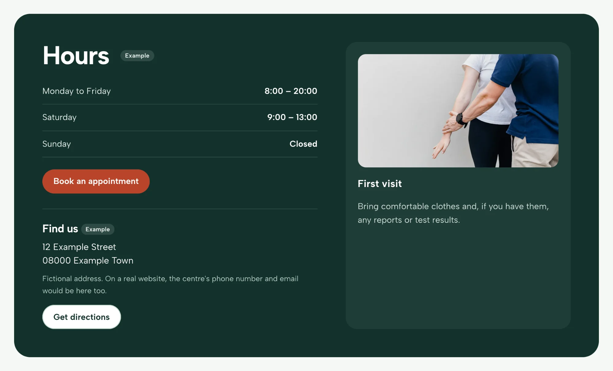
All the practical information, together
The hours and what to bring to the first visit sit in the same block, in a dark colour that sets it apart. Visitors have what they need to decide without having to call.
Identity
Sage greens to convey calm, a warm terracotta for the actions and a round, friendly typeface.
Let's get your body moving again.
Sports physiotherapy, back pain and recovery after an injury. The first visit always starts with a full assessment.
Albert Sans, a sans-serif with rounded forms: heavy weights for headings and plenty of air in the body text.
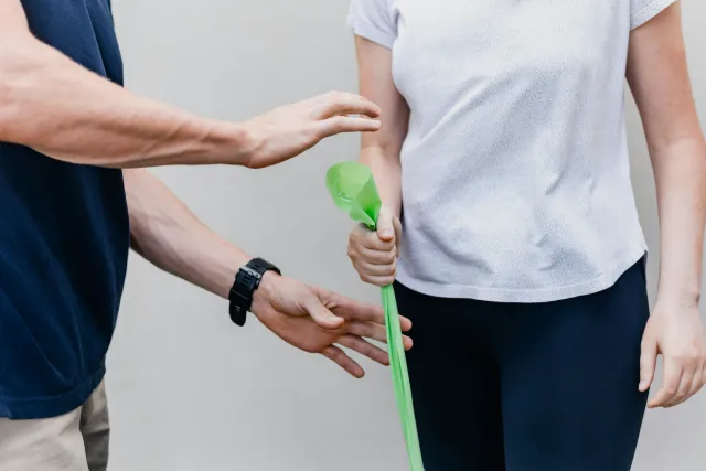

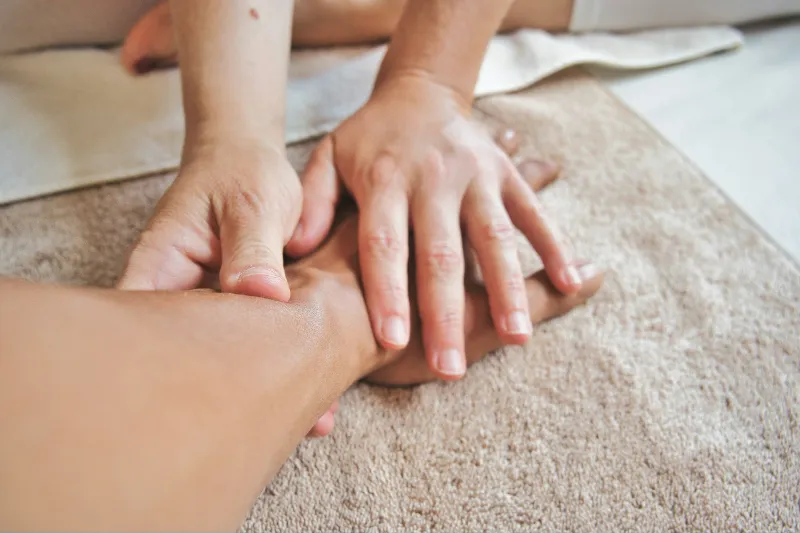
The whole page
Scroll inside the window to go through the concept from top to bottom, as it looks on a computer.

Or open the concept and browse it.
On a phone
The same content, arranged for the small screen, with the appointment button always within reach of your thumb.
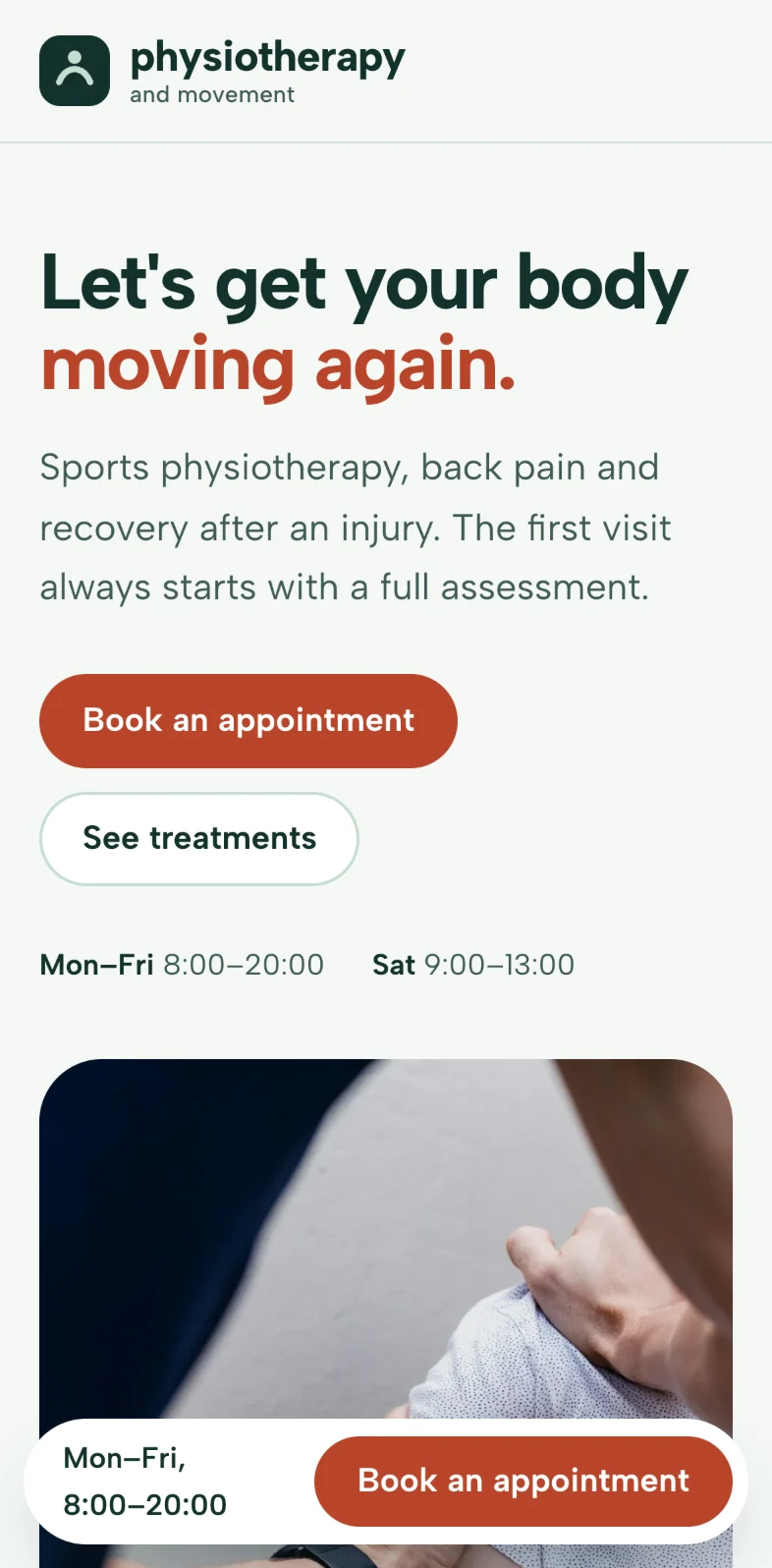
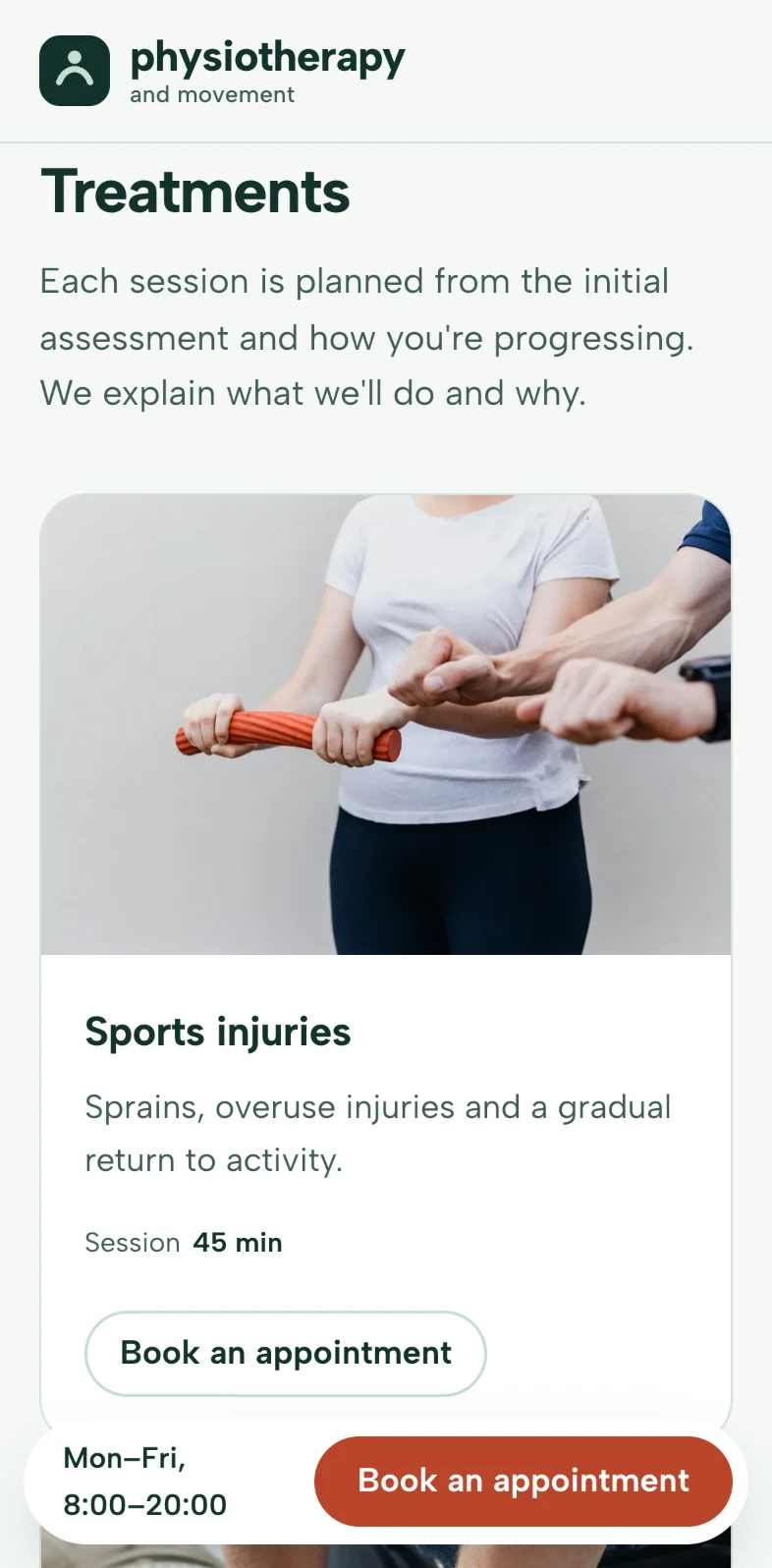
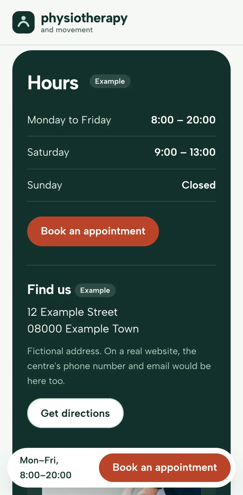
Real screenshots of the concept on a 393-point-wide screen.Open it on your phone